Top Painting Color Trends For 2021
This year’s interior color schemes are going to be a lot more colorful! This is excellent news for all you color enthusiasts. You no longer have to dance around sneaking in the bright and cheery color palettes you’ve been yearning for. And if color isn’t your cup of tea, don’t worry! The best part of this year’s trends is that you get to choose how they work in your home.
You can incorporate every color of the rainbow by sticking to muted tones. Mid-tones (the middle color blocks on the paint swatches) will help achieve a softer, less contrasted look. Tone on Tone is also here to stay and a wonderful way to make a bold color statement whether you opt for bright primary colors or saturated neutrals. You can match your baseboards and trim to your walls or go even more daring and throw in a matching sofa.
A growing desire to feel calmer in our daily lives and a renewed enthusiasm for nature has inspired the color trends predicted by institutions like Pantone, Sherwin Williams, Behr, Benjamin Moore, and more. Earth tones, ocean blues, and forest greens have made appearances on the lists, but that didn’t stop statement neutrals such as grey or vibrant brights like yellow from showing up either.
Read on to discover some of the top color trends forecasted for 2021.
Ultimate Gray and Illuminating Yellow
Perhaps one of the most referenced authorities when discussing color trends, the Pantone Color Institute holds a secret meeting in Europe twice a year. Several color standards groups representatives from different countries meet to deliberate and declare a “Color of the Year.”
This year, they’ve announced two selections: Pantone 17-5104 Ultimate Gray and Pantone 13-0647 Illuminating. The gray encapsulated strength and fortitude while the bright yellow promises positivity and optimism. It’s like the grounding of pebbles on the beach with the vitality of the sun overhead.
Both colors are very bold. Start small by introducing them into your space as accents using pillows, rugs, or pottery. Ultimate gray can provide a lot of depth and texture and works beautifully as a feature wall color or a statement piece of furniture. The illuminating yellow will bring a hit of color, especially when paired with the gray — think yellow dishes, velvet dining chairs, or light filtering curtains.
Aegean Teal
Nature-inspired, yes, but perhaps even more accurate would be the term vacation inspired. Named after the Mediterranean sea, Benjamin Moore’s color of the year, Aegean Teal 2136-40, is the holiday getaway we were all dreaming of in 2020. A soft, soothing color that reads somewhat blue and somewhat green, it blurs the line between overtones. It can read as bright and fresh but also dark and moody. The gray undertones keep it from feeling dated which mean it would work in a modern interior. Aegean Teal would add a tranquillity well-suited to bedrooms and home offices. The depth of the color would also demand attention on cabinets or built-ins.
To make decorating a bit easier, Benjamin Moore has put together a 2021 color trends palette of deep earth tones, rich, creamy whites, and buttery yellows that pair seamlessly with Aegean Teal’s cool undertones.
Urbane Bronze
Sherwin-Williams’ Urbane Bronze SW 7048 is a nuanced neutral boasting a rich, bold gray-brown that feels effortless, sophisticated, warm, and grounding. According to their website Sherwin-Williams selected Urbane Bronze “to let a color rooted in nature create a feeling of calm and bring all you cherish together.”
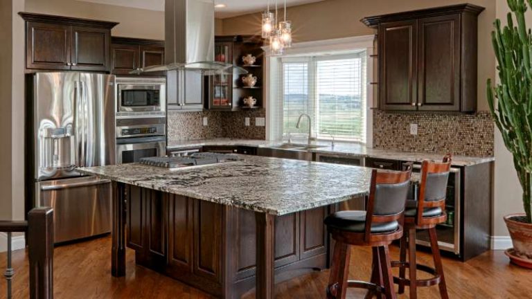
This dramatic hue is versatile enough to turn heads in a room, whether used as an accent color or on all four walls. Its versatility stretches across the entire house, too. Add a cozy feeling to the bedroom or den walls, give living room built-ins or kitchen cabinets a more contemporary feel, or add a dose of drama to your front door.
To emphasize the raw, organic, natural energy of this hue, Sherwin-Williams recommends pairing it with their Modern Gray, which is more of a beige gray or an army green along the lines of their Messenger Bag. Mix in other elements from nature such as wood, stone, leather, or aged metals to add texture and range.
Comfort Colors
Behr went a different direction this year by presenting a select group of color palettes that zeroed in on a feeling. They curated their top 21 colors that they believe will “elevate your comfort zone.” Many paint companies comprise palettes of the year, but what sets Behr apart this year is the palette’s organization into six unique themes — making it easy for homeowners to hone in on a complete color scheme for their room or home. Behr also went the extra mile by ensuring that the entire palette could mix and match for those looking for more personalization.
Don’t make the mistake of thinking that because the palette has a cohesive feel, it’s boring. Far from! The Casual Comfort theme is the most accessible, comprised of warm neutrals like the beige leaning Almond Wisp PPU5-12 and the pale pink Seaside Villa S190-1. However, the Quiet Haven theme is ironically full of dramatic hues like the deep gray of Broadway PPU18-20 and the moody olive green of Royal Orchard PPU11-01. The other four palettes cover everything in between. The collection is a representation of 2020’s color trends being both colorful and subtle.
Mood Defining Hues
After reflecting on 2020, Farrow & Ball also took a multifaceted approach to their color of the year. Instead of one color, or even one announcement, they opted to keep things suspenseful by announcing the four moods that would dictate the color trends of 2021. Since October, their color curator, Joa Studholme, has highlighted key colors for each mood, making it easy for homeowners to pull together a color scheme for a room or even their entire home. So far, three of the four moods have been announced and are as follows:
Rich, warm, earthy tones inspired by nature will drum up cozy feelings and turn the space into a relaxing haven. To achieve this look, Studholme recommends using the richest and warmest colors in their palettes. Her choices? The saturated and moving trio of Deep Reddish Brown (No. W101), Tanner’s Brown (No. 255), and Preference Red (No. 297). Again, the best part is that you can use as little or as much as you’d like. These colors can stand alone or complement the most neutral of spaces.
Blue is a color that has withstood all trends. For 2021, Stodholme predicts clean, nature-inspired blues with cool undertones will result in rooms that feel peaceful and reassuring. The four blues highlighted on the Farrow & Ball website range from the colors of the sea and sky (Ultra Marine Blue No. W29 and Pitch Blue No. 220) to a nighttime sky (Stiffkey Blue No. 281 and Scotch Blue No. W24). Perhaps the best attribute of these colors is their adaptability to different styles. They work with a more traditional aesthetic but can also be the wow-factor in a more modern or contemporary one.
Rounding out the suggestion of natural world influence, so far, are three shades of green that are different in undertones but kindred in their ability to inspire. Treron No. 292 has a hazy grey undertone, while Green Smoke No. 47 has a smoky blue one; and Sap Green No. W56 has a bold olive green flare. Beautiful on painted walls, treatments like wainscotting, or colored cabinets, green can be an intimidating commitment for many homeowners. The color green is associated with calmness, which means it would be perfect for living rooms and family rooms; or any other space designed for relaxing. If you still feel unsure about location but love the color green, Stodholme suggests using any of the three green hues in a hallway.
As with any interior design trend, it’s only going to work if it works for you. If you like to stay current and want to avoid feeling like your home is outdated, look to this year’s top colors as inspiration. The best color scheme for your home is the one you love.
When you choose Image Line Painting to paint your home exterior you’re partnering with a team of professionals. As a family owned and operated small business you can count on our integrity, honesty, communication, punctuality, and ability to lead our small team through the completion of your project.
Why Choose Image Line Painting?
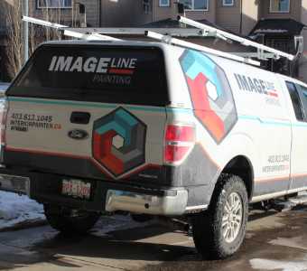
Image Line Painting is a family owned and operated small business you can count on our integrity, honesty, communication, punctuality, and ability to lead our small team through the completion of your project. You can count on friendly, knowledgeable service with a high quality finished project.
We have many happy and satisfied customers throughout Calgary. Owner (Cristian Farkas) is checking in on every project and takes great pride in the work that Image Line Painting completes in our customers homes. We care about your project and we want to make sure we do the best job we possibly can. We provide unbeatable value, we keep your home spotless, our pricing is fair, and the quality of our cabinet refinishing work is unmatched.
If you’d like to schedule a painting consultation with Image Line Painting please give us a call 403-613-1045 or fill out our online contact form and we’ll get right back to you.