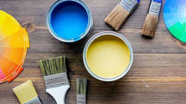
8 Popular Interior Paint Colors and How They Affect Your Mood
Does your newly purchased home need a refresh or do feel like a design change? Picking the right interior paint colors is important in either scenario.
Sure, you can swap the color at any time, but you want to enjoy the shade you choose for more than a little while. We have an idea to help you narrow the decision-making process and make sure you’re happy with what you choose. Learn more about how paint colors can impact your mood.
Here’s a quick guide to eight popular interior house painting colors and their mood-boosting qualities.
Interior Paint Colors and Mood
If you ask a scientist exactly specifically how colors affect people, you probably won’t get one definitive answer. But we do know there are certain feelings and preferences people have toward different hues.
People react to both the saturation and brightness of colors, whether they’re warm, cool, or neutral. Saturation has to do with the purity of a color and brightness is linked to how a light a color is.
On the color wheel, warm colors are shades that are saturated and less light like red and orange and yellow. These shades can be cozy and invigorating.
Cool colors like blues, greens, and purples are on the opposite end of the spectrum. They have a cooling and calming effect.
Neutral colors, on the other hand, like white, gray, black, and tan are understated and have a neutralizing effect. Some gray and black shades can be warm or cool depending on their makeup.
There may not be a ton of scientific evidence to back up the way people react to colors. But psychologists and researchers agree that culture, personal experiences, and time seem to make an impact.
Room Colors and Moods
There isn’t an absolute rule about how exactly people respond to colors. But there are some common color moods to keep in mind.
These are considerations our residential painting experts can help consider when deciding on the right interior paint colors for every room of your home.
Blue: Relaxing and Inviting
Did you know that blue is the most popular color across the world and across cultures?
It seems that no matter the locale, people generally have a positive association with the shade.
Blue is a compelling interior paint color choice because of its versatility. Depending on the shade you choose, you could use this shade in multiple rooms of your home or apartment.
Dark and deep blues like navy or sapphire could really punch up and energize a room. Even though blue is on the cool end of the color spectrum, a deep blue can have an inviting effect.
On the other hand, a light sky or robin’s egg blue can have a relaxing feel. The cool nature of these lighter shades tend to help people feel calmer.
White: Clean and Fresh
White is technically a lack of color, but we attach many meanings to it. Many people associate white with purity, cleanliness, and even innocence.
If you want to brighten or open up a smaller room, white could serve that purpose by reflecting light in a way that gives the illusion of more space.
Since white is bright and light, it can also help create an uplifting and clean feel in a room. And a warmer white color could also make a space cozier if you want a light color but a more intimate feel.
Gray: Calming and Illuminating
If you do a search for bedroom colors and moods, you will probably end up running into gray as a recommendation.
Gray can have a calming effect and also give off an err of class and sophistication. Both of these qualities could work well in a bedroom since cooler and less vibrant shades help promote better sleep and relaxation.
Shades of gray or silver could also be appealing in entryways. They can brighten this welcoming area of your home while also creating a calming environment.
Pink: Soothing and Playful
It may be surprising, but pink can also have similar relaxation benefits as shades like gray and blue. Soft pink tones can be especially soothing and stress-relieving, which can be good for an office or work space in your home.
Pink can also have a warm and playful effect on moods, which could be ideal for a child’s room or play area.
Yellow: Energizing and Uplifting
Another great paint color for children’s rooms and nurseries is yellow, especially lighter shades. Yellow has that same sort of playfulness that pink can have. It also has a positive and energizing feeling to it already, which can make it ideal for areas of your home where you get a lot of light.
The combination of a very warm vibrant yellow with natural light can really help boost your mood or help you start your day right.
Green: Grounding and Stabilizing
Like blue and gray, green can have a calming impact on our moods. Many people associate green with nature, which can promote feelings of peacefulness and comfort.
In addition to a calming effect, green can symbolize with renewal and growth. You could easily find the right shade for an inviting and tranquil living room, kitchen, and or even bathroom.
Red: Best for Social Areas
Red is a bold color that can draw out some strong emotional responses such as anger or passion.
In terms of applying this color in your home, choosing rich shades for social areas can create an appealing and welcoming feel. A pop of red here or there in a room can also inspire a feeling of warmth.
Orange: Stimulating and Motivating
Orange is another shade on the warm end of the color wheel. It brings about similar emotional responses as yellow shades do.
Bright and deep shades of orange can be invigorating and joyful. These colors could also offer some coziness, which could make them great for entryway areas or rooms where you entertain guests.
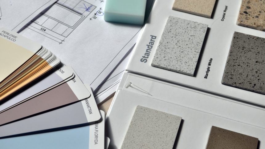
Work With the Best Interior Painters in Calgary to Find Your Perfect Shades
Are you ready to decide on the best interior paint colors for your current, new, or future home? You’ll want to work with the best interior painters in Calgary.
When you’re ready to take the first step, give us a call. Or request an estimate with just a click of a button. Get a painting quote today!